|
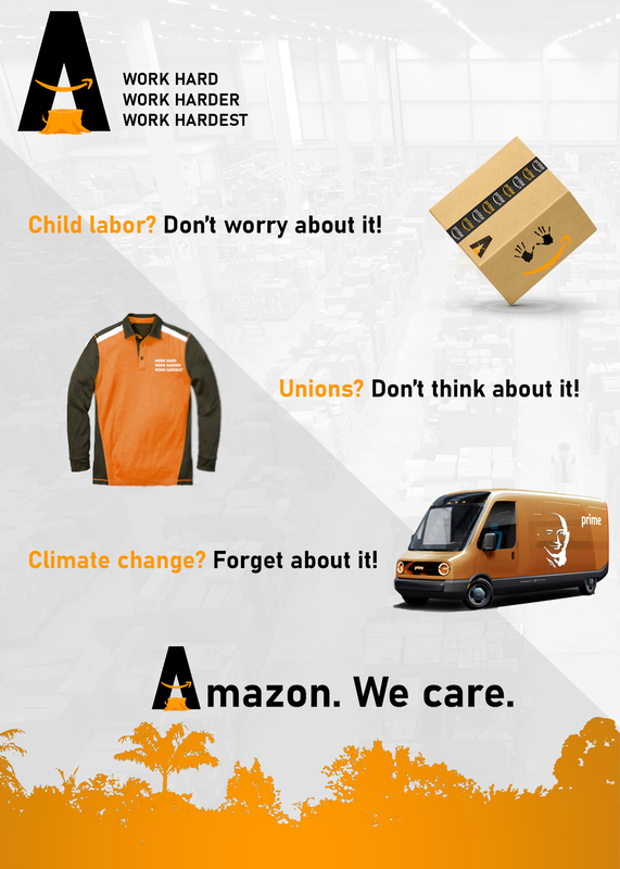
I thought it would be interesting for my rebranding project to do a satirical piece. First, I kept the orange color Amazon used, as I was sort of inspired by orange's association with avarice in Green Lantern. Given the ostentatious and comical wealth Amazon has accumulated, I thought it was appropriate to keep the orange color.
After doing some research on the controversies Amazon has racked up over the years, I chose to focus on Amazon's use of child labor in China, lack of workers' rights in their warehouses, and climate change. First, the representation of child labor was depicted through the small handprints. At a casual glance it would generally seem innocent and not overtly jarring with the implementation of the arrow forming a happy face on the side of the box. However, once the symbolism is understood, it becomes obvious how morbid the design is. The shirt design I did for Amazon workers was kept simple, but the most prominent aspect was the "WORK HARD WORK HARDER WORK HARDEST" print I placed in place of the Amazon logo. It would serve as a not so subtle reminder of the ruthlessness of the Amazon hierarchy. Last of all, the truck also had minimal changes apart from the Jeff Bezos face placed on the side of the truck. This imagery also serves as a reminder, but to the customer this time, of who is benefitting off of their purchases. Despite Amazon's efforts to reduce their carbon footprint, their carbon emissions rivals that of countries. |
